Every Woman’s Marathon
Every Woman's Marathon
Creating a running culture made for women by women
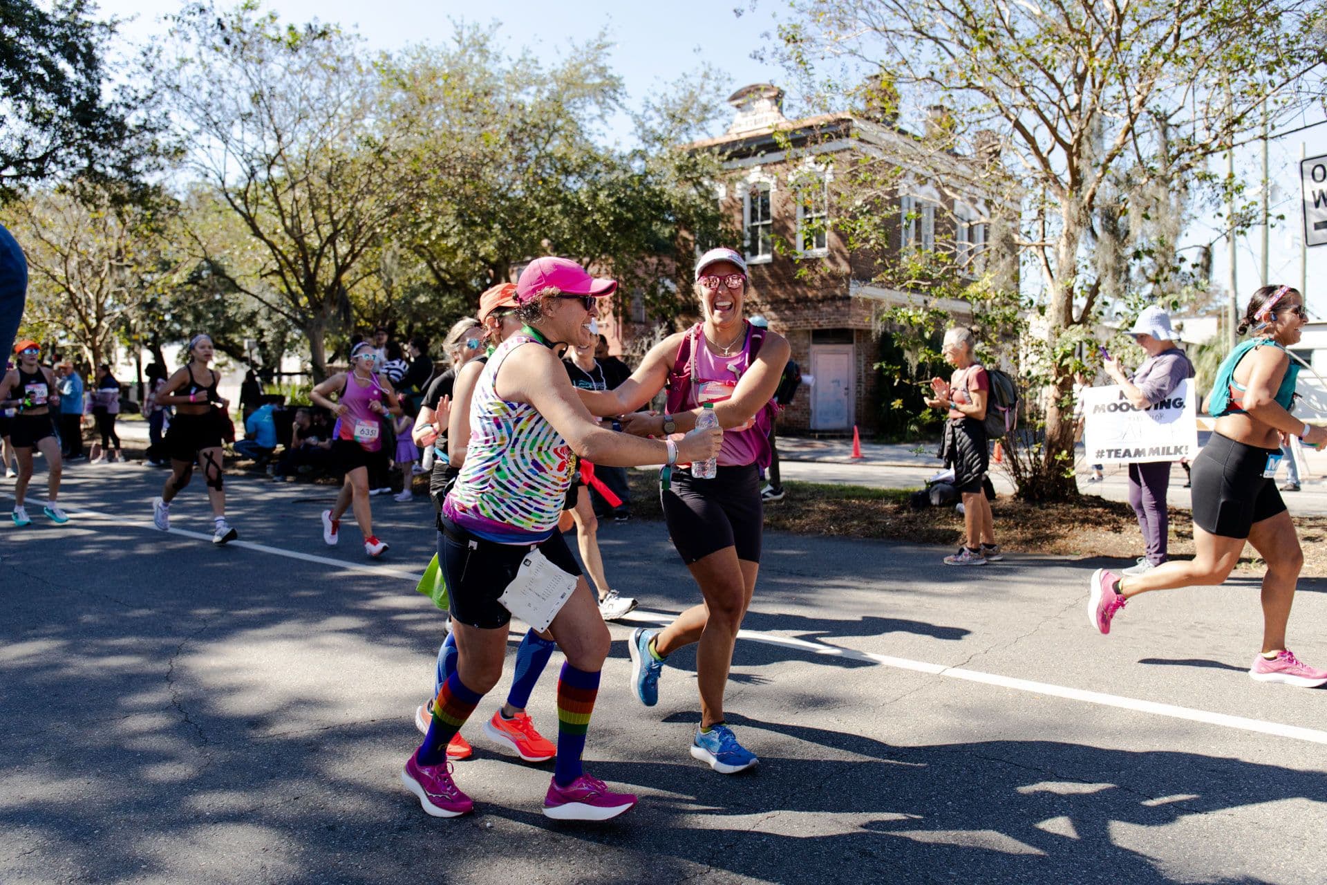
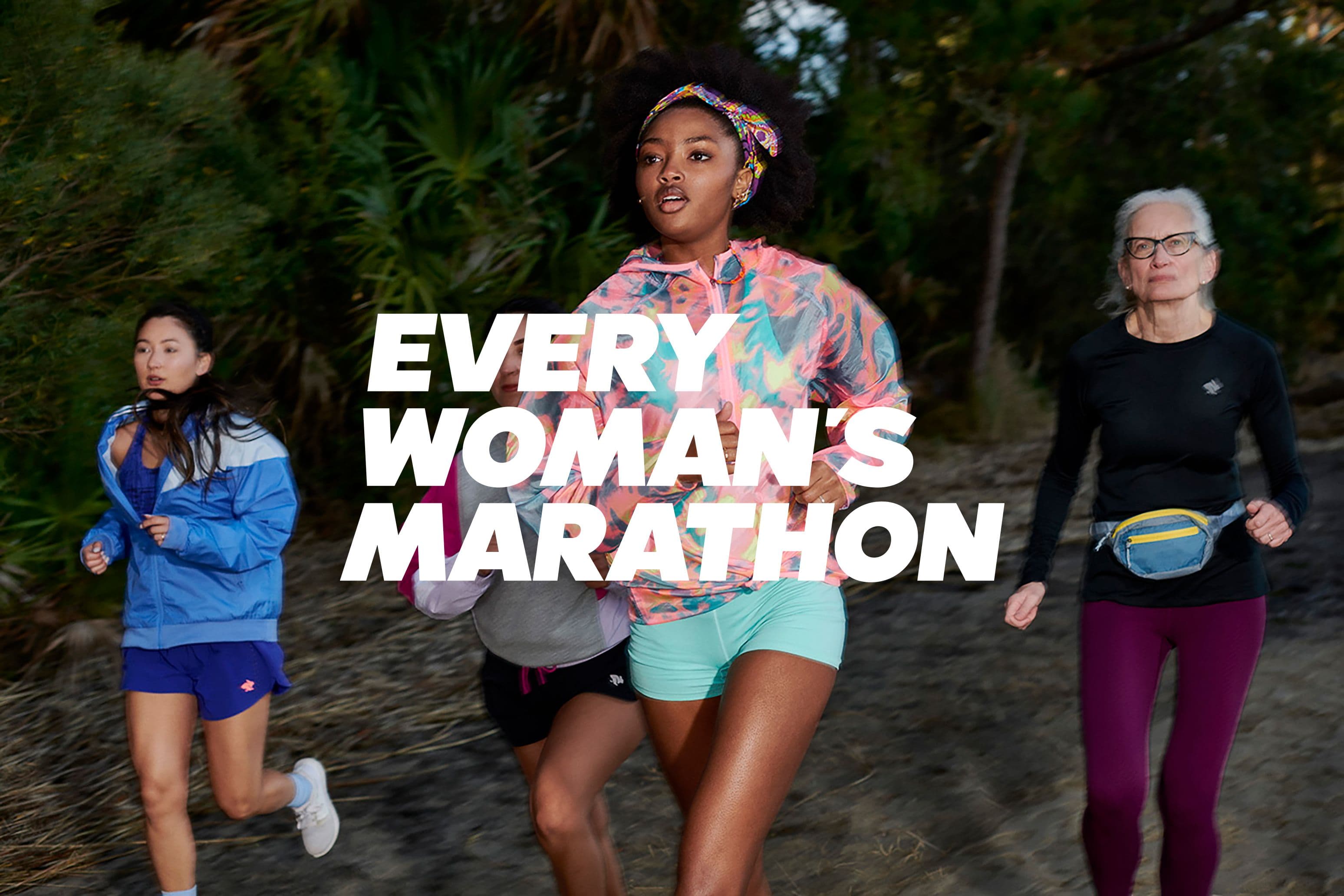
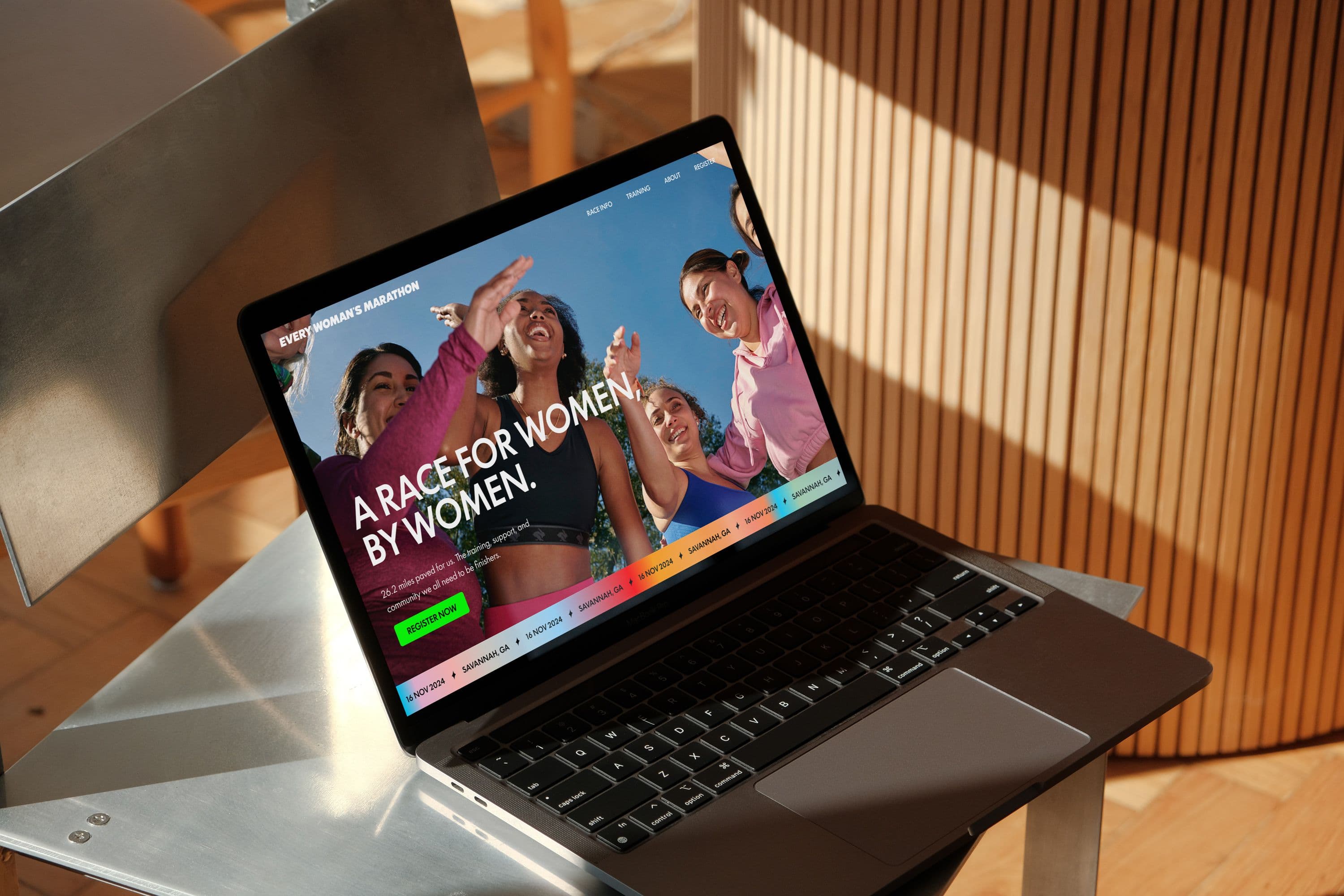
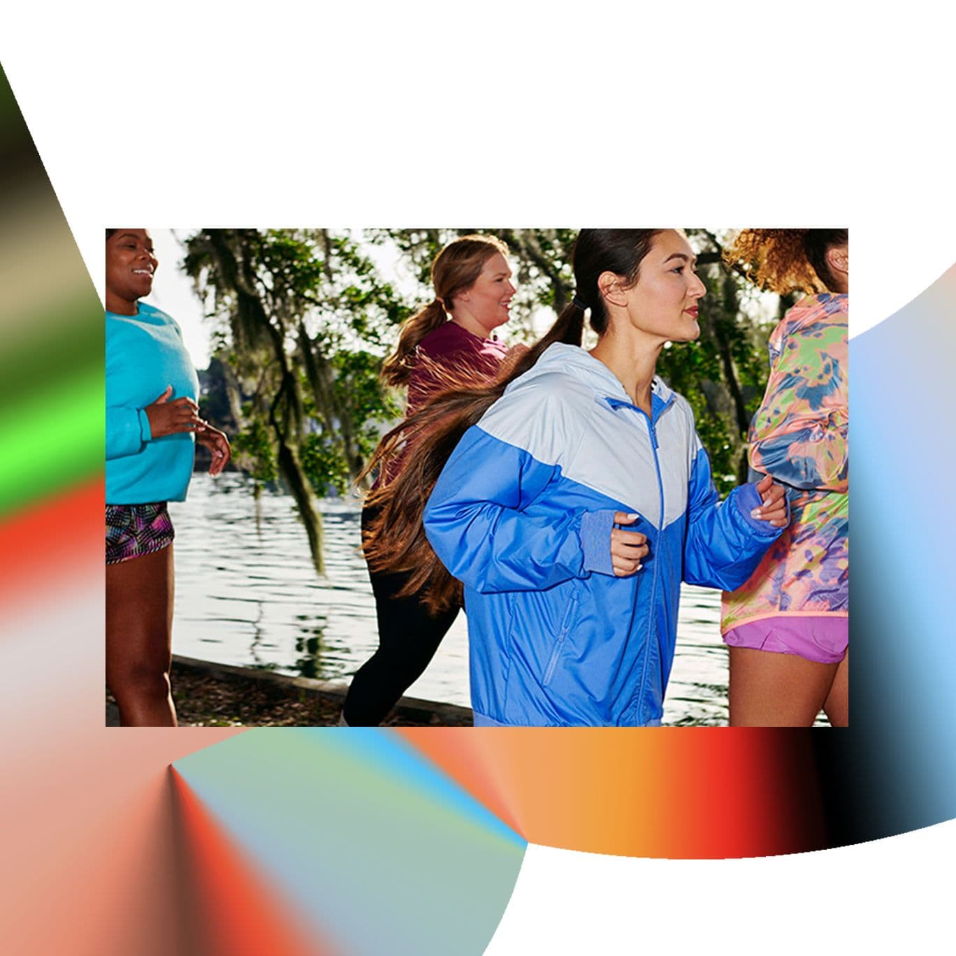
Every Woman's Marathon is exactly what it sounds like, an all-women event spearheaded by an all-female advisory board, partnerships, and wider community. The goal is to provide the most accessible and fun race for women of all levels and abilities.
Every Woman's Marathon is a race, but the goal is not to win. The race exists so that women can show up as a team, regardless of background or ability. At this marathon, every woman is welcomed and encouraged with open arms. We built the race's identity and graphic system based off that idea of unity as the core foundation. Themes of community and togetherness radiate throughout all assets.
Partnerships
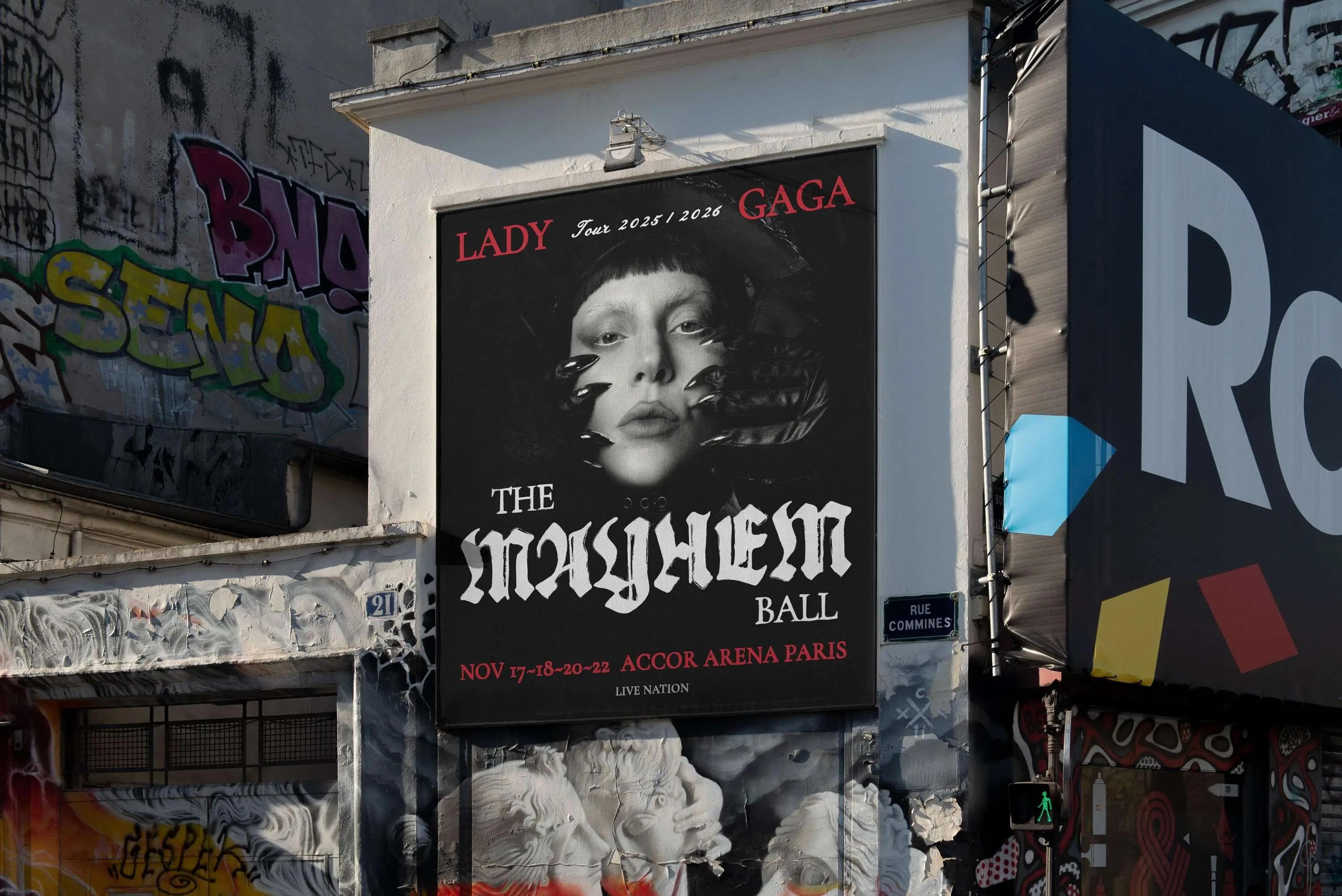
GALE
Business Agency

Miranda Abney
VP of Commercial Marketing, MilkPEP
Results
Over 40% first-time marathoners
7000+ runners on the first year (sold out race)
770M+ impressions at launch
Invitation to unite
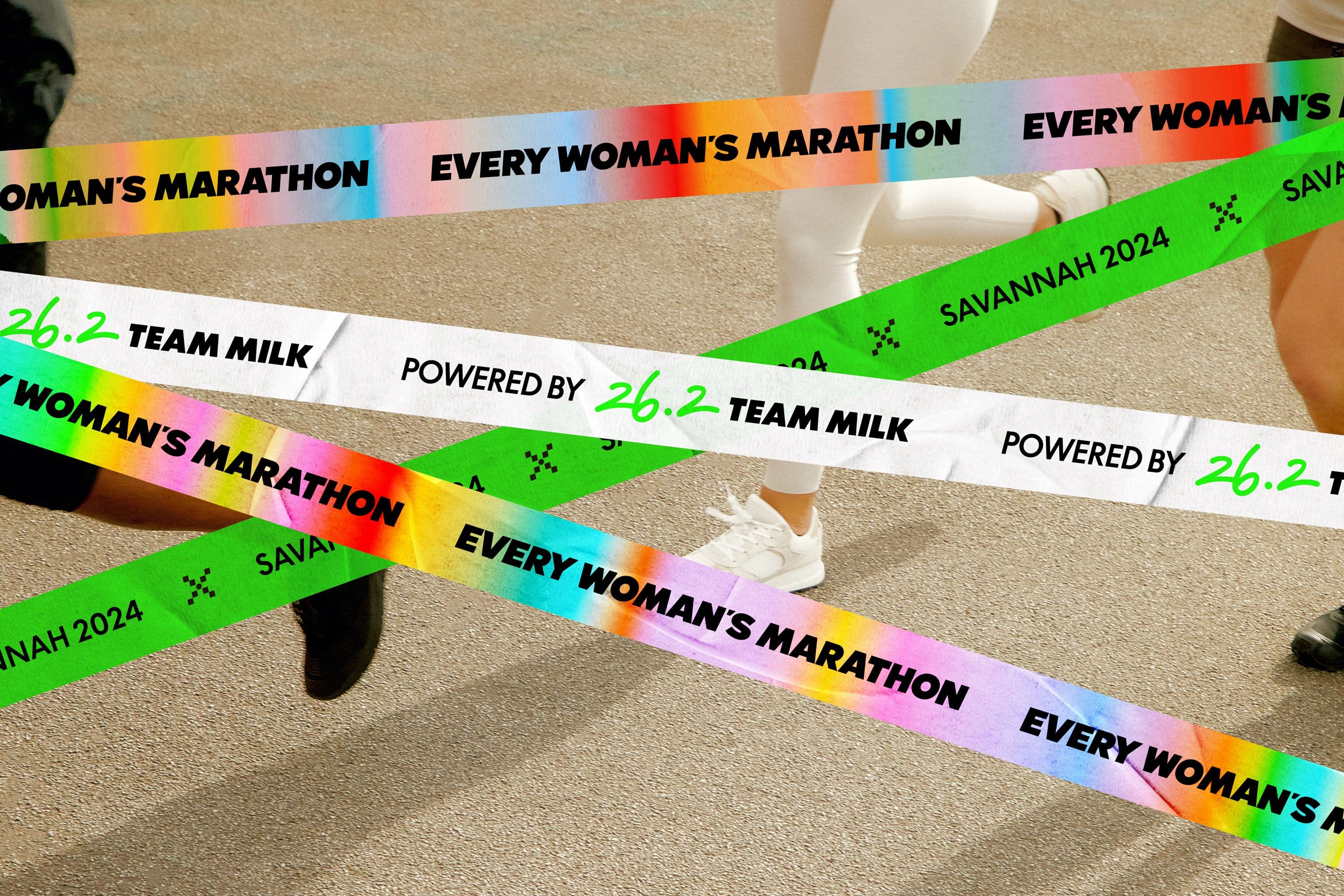
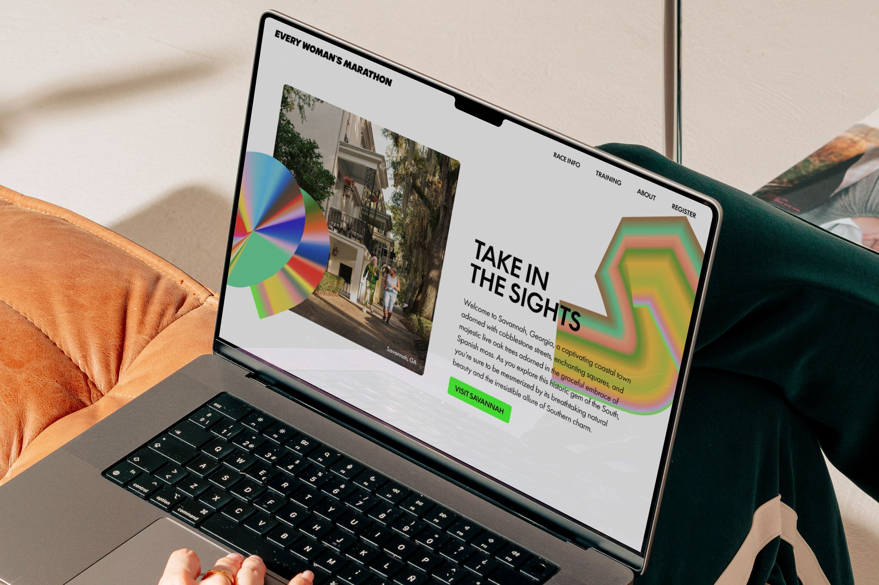
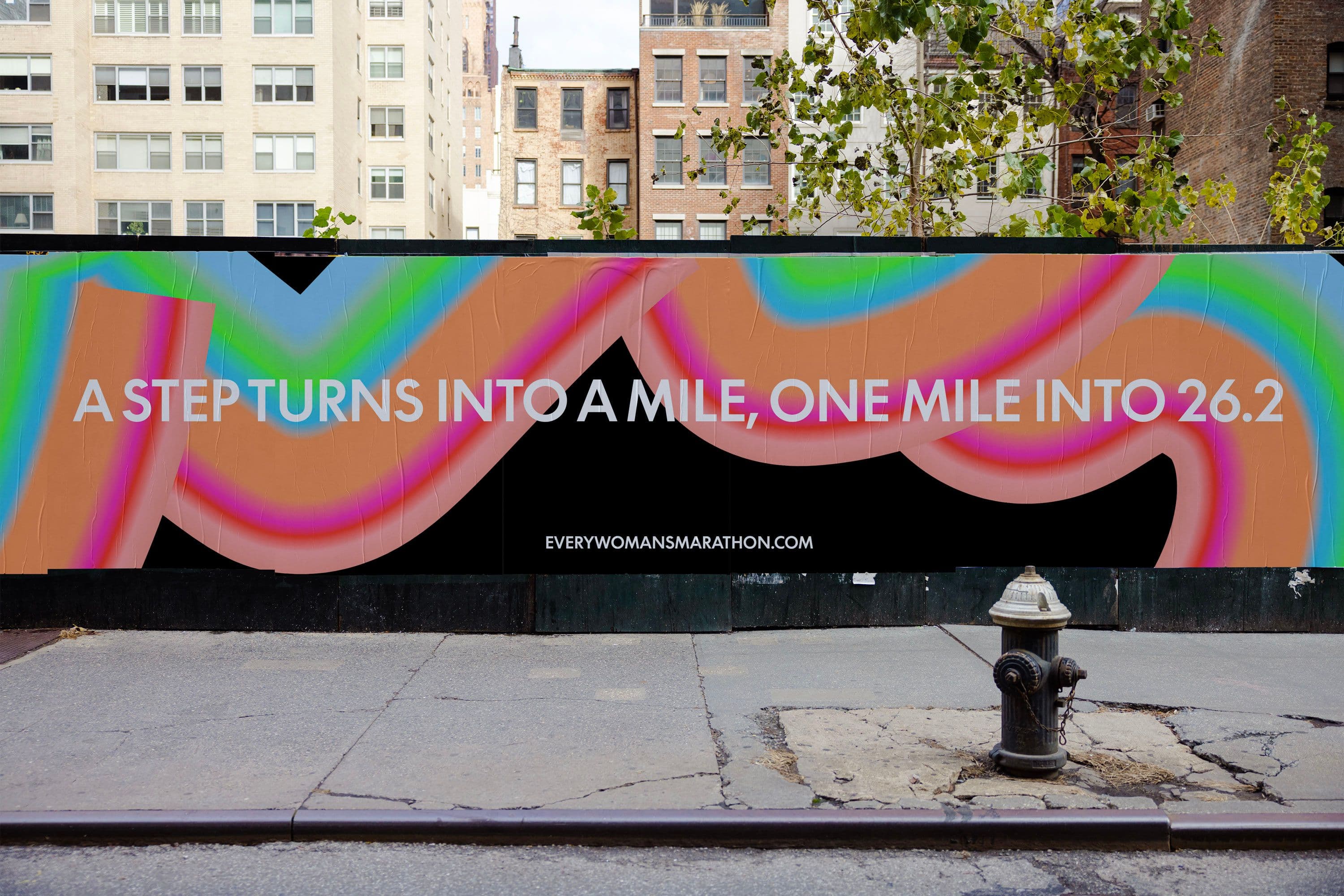
The logotype is blocky and bold, meant to represent the ambition of this event, creating a clear message for women to come together. Keeping the logo stacked and slanted mirrors a flag-like shape, championing our community as a group all to our own.
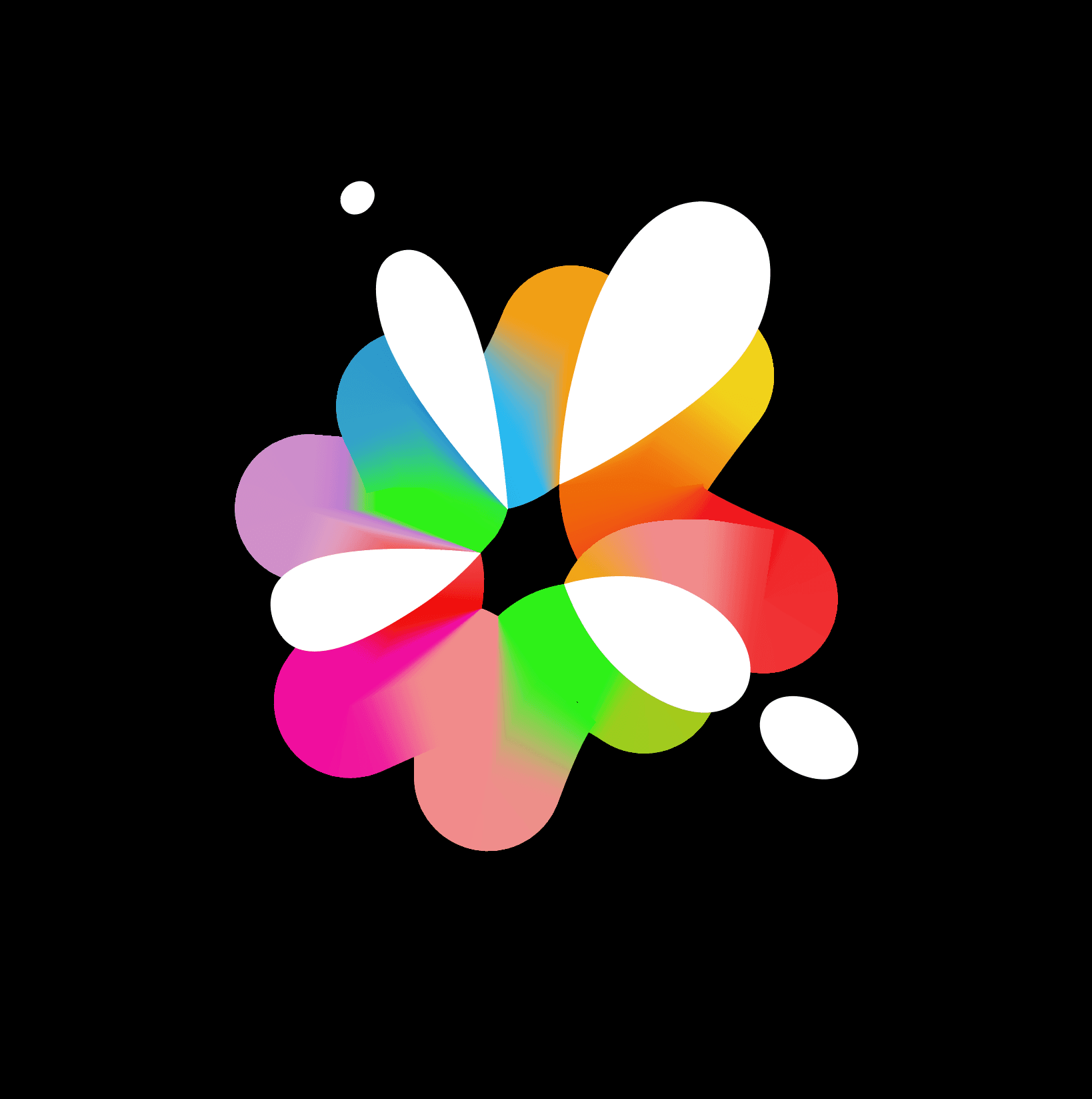
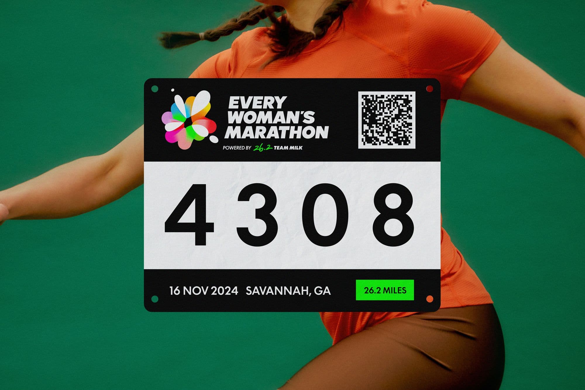
The emblem represents the uniting force between Every Woman's Marathon and Milk's sponsorship. The colorful gradient bursts outward as a symbol of the collective energy and joyful celebration that emerges when we all come together.
Represent every woman
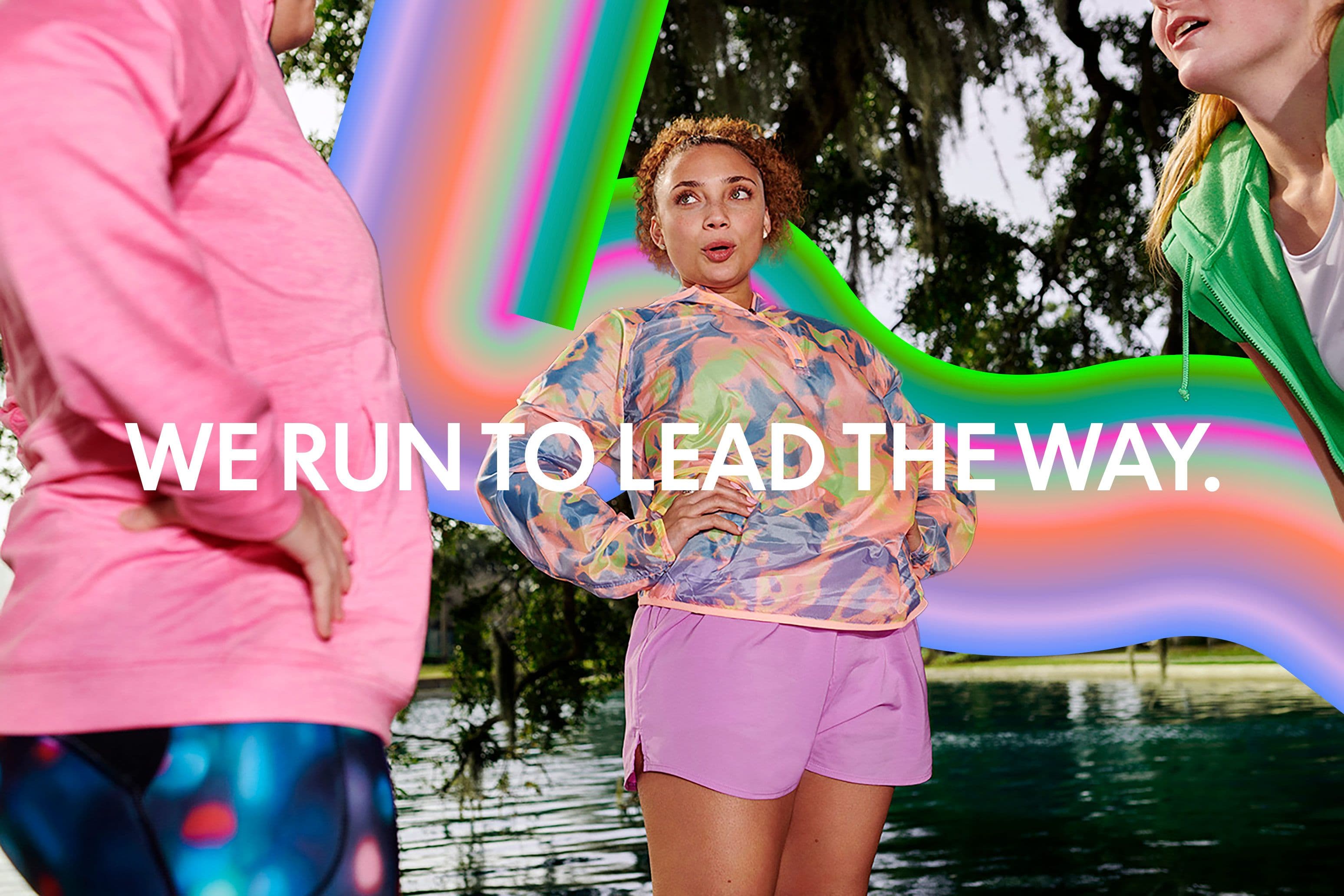
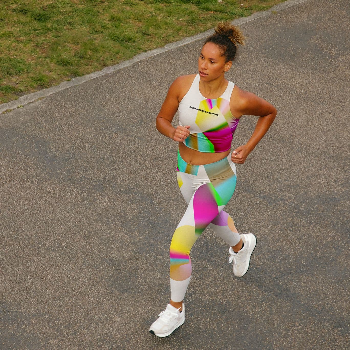
Our broad range of colors in our gradient system represent different types of runners, such as The Moms, The Barefoot Runners, The Newbies, The Walkers, The Easy Runners, and The Celebrators. The varying color combinations and thickness within the gradient work together to further highlight the sense of community resonating between all participants.
Move Together
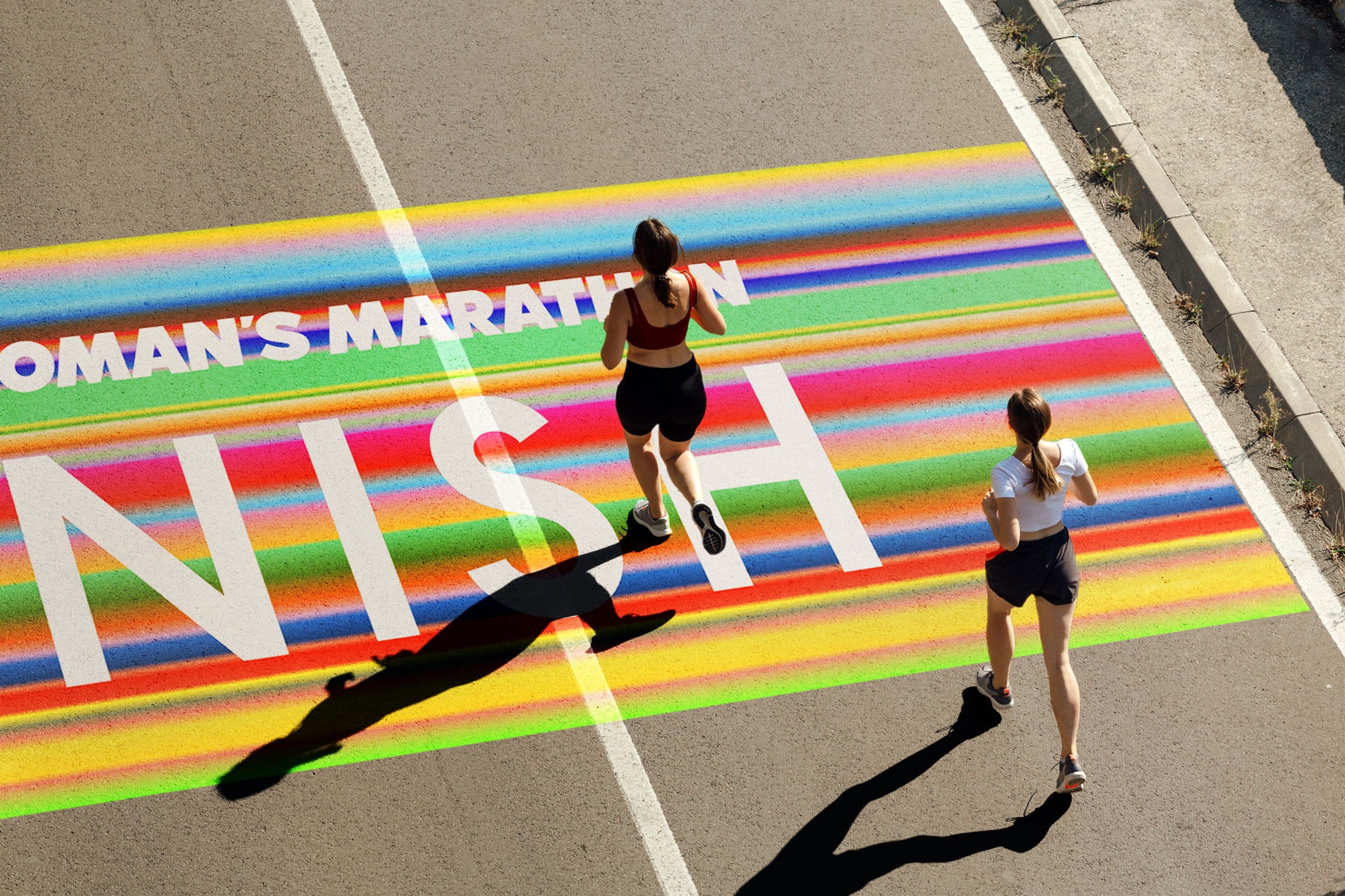
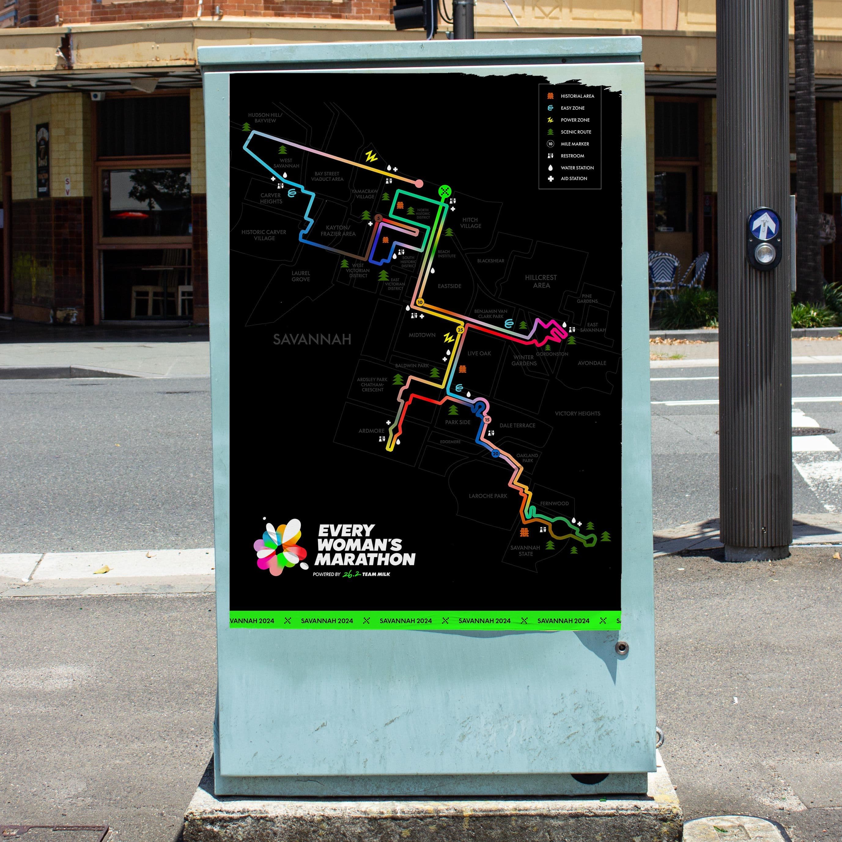
By using shapes and paths as metaphors, our graphic language aims to inspire and uplift our audience by capturing these daunting distances as a collection of small wins worth celebrating.
Our gradient paths create a blur effect, mimicking the moving city sensory as you are running or in motion. The choreographed movements represent the different twists, turns, and pause within any given runner's journey.
Say it with confidence
LL Supreme presents a tougher, crisper and more geometric take on the classic typeface Futura, and, it was used in the previous Milk's 26.2 sponsorship program. We draw from its strong and distinctive characters that allow us to speak with confidence and clarity.
From our first meeting to our last, it was an absolute pleasure working with Melody and the Yung Studio team. The level of detail, thought, and care that went into the moodboards, to the deep typography knowledge, to the final brand guidelines – they are true masters of craft . Not only that, but they are genuinely kind, flexible, and considerate in their working relationship. I would work with them again in a heartbeat.
 Janelle Lamothe, Associate Creative Director of GALE
Scope
- Visual Identity
- Art Direction
- 2D Motion
- Collateral Design
- Brand Guidelines
Team
Melody Yung, Creative Lead
Devon Stern, Design
Yu Rong, Design
Gabrielle Adam, Design
Credits
Gale Partners:
Janelle Lamothe, Associate Creative Director
Damien Lecocq, Associate Design Director
André de Castro, Creative Director
Nicola Pardy, Sr Producer
Giant Artists:
Caroline Tompkins, Photographer