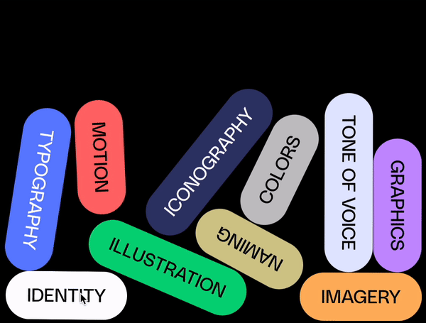
Why do we stay clear of people-based illustrations to humanize brands for early startups?

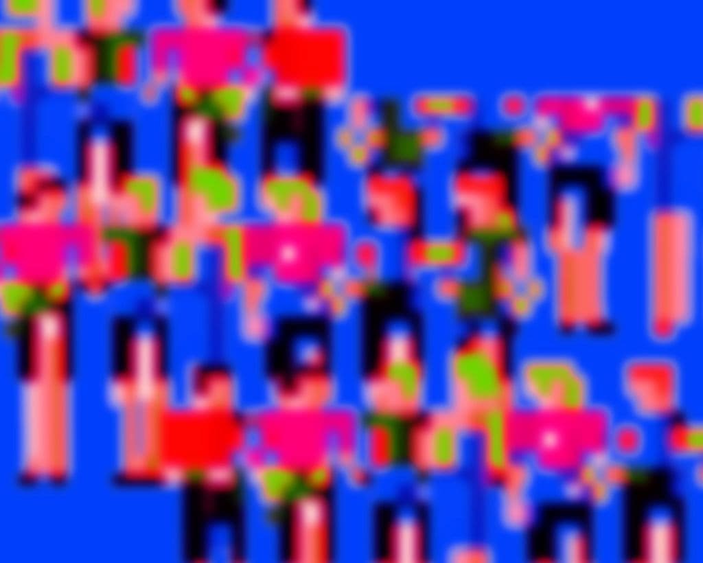
Some of the creatives, including myself, are probably glad that big tech’s “human-like” illustration styles – aka Corporate Memphis – are finally going away quietly.
If it’s done right, it’s actually very memorable as a storytelling tool. I still love Robinhood's early branding with the gamified, futuristic style, as well as Next Insurance’s optimistic yet nostalgic characters (Shout out to beautiful work from Collins (opens in new tab)!) It requires great art direction and a large team/budget to make sure it’s own-able AND scalable for growth-stage companies.
For early startups, with budget and time restrictions, we often see generic people illustrations with a fake sense of cheerfulness and togetherness – from productivity software to fintech products to health services. The problem is: it actually blends your brand in the market because those exaggerated, colorful people with long limbs are so overused.
At Yung Studio, we are always looking at new, creative ways to make brands connected to their customers emotionally. How about bringing the real people and real stories to the forefront of your landing page? What if we created abstract artwork that captures the journey of recovery? Can we look at beautifully designed typefaces that speak to your bold ambitions? How about a color palette that reminds customers of the comfort of home for an at-home product?
I hope this memo inspires you to go out there and make something creative and different.