Outer Bio
Outer Bio
Making the invisible signals of skin visible
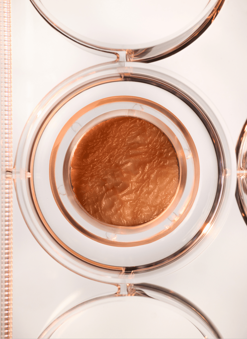
Outer Bio discovers and develops novel bioactives for health, skincare and cosmetic products. Its platform, Yuna, pairs predictive machine learning with full-thickness human skin that stays viable for about four weeks, far longer than standard models, so compounds can be tested in true-to-life conditions at scale.
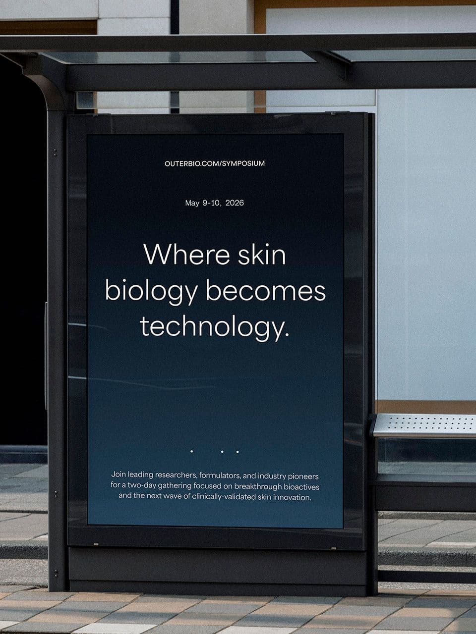
We helped translate the founding team’s vision and ambition into a brand system grounded in a concept of Signal Within that reveals the hidden patterns, rhythms, and data beneath the skin’s surface. Through identity, graphic, and photography, we built a visual language that makes complex science feel intuitive, emotional, and alive, bridging industry expertise with human understanding.
Partnerships

Michael Polansky
Co-founder & CEO

Encoding cellular connection
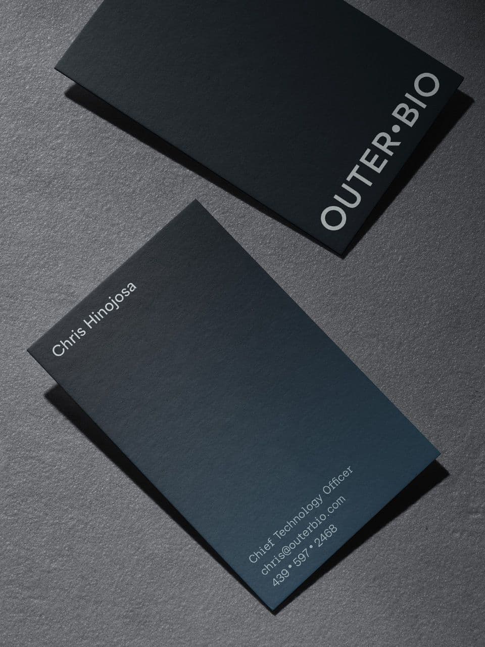
The Outer Bio logotype is designed as a system of connection. Simple letterforms are linked by a central dot, echoed in the negative space of the first and last “O.” This structure reflects how skin cells interlock and communicate within living biology, while also referencing the coded markings and notation used in scientific experimentation. The result is a mark that feels both biological and technical.
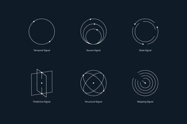
A system of marks built on the same code
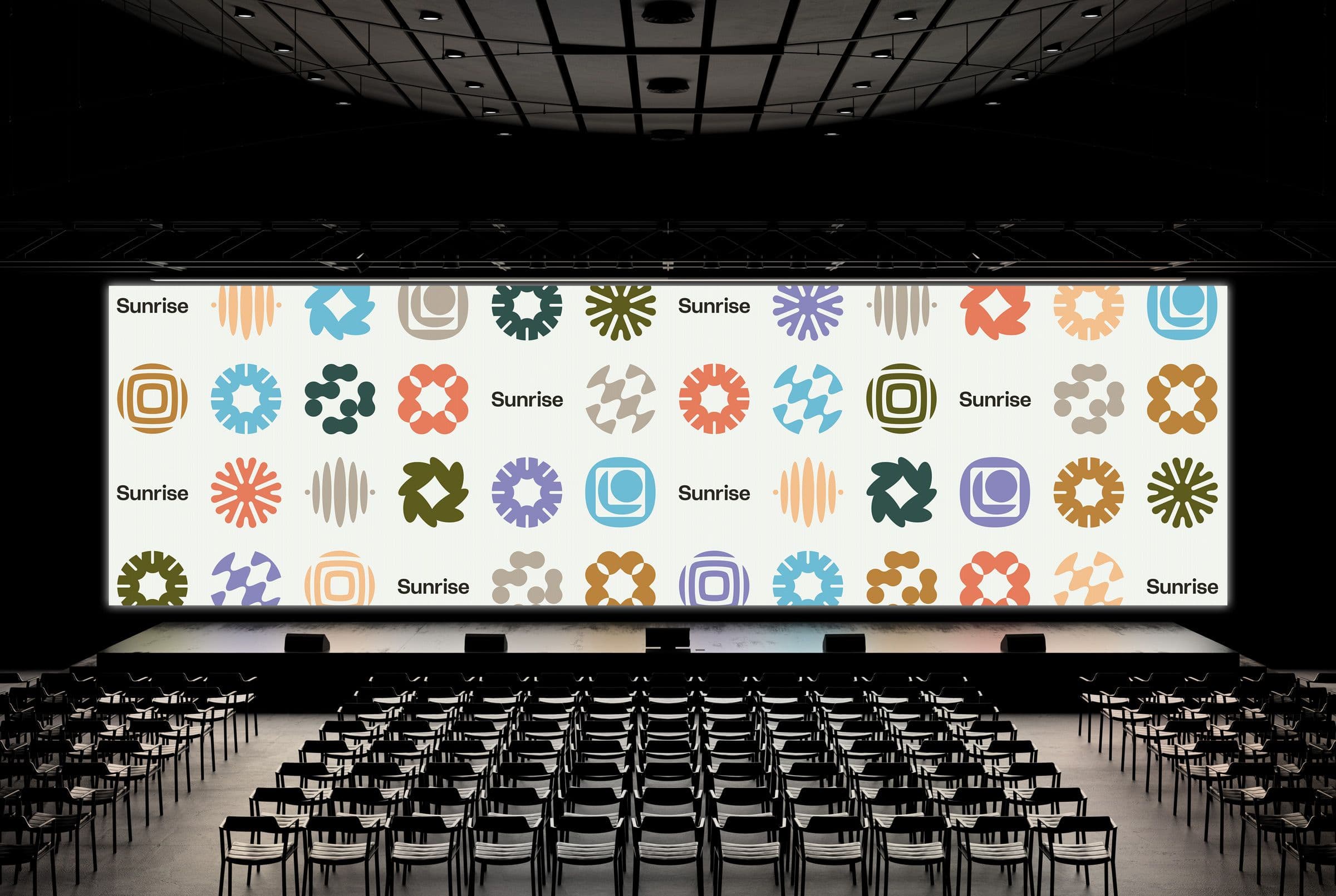
The icon set extends the logic of the identity into a supportive visual layer. Each icon draws from the same source as the logotype: the dot and fine line as coded markings used in scientific experimentation, translated into simple, consistent shapes. Rather than illustrating literally, the icons distill dense research concepts down to their essentials, giving Outer Bio a visual shorthand that stays legible across the platform while quietly reinforcing the brand’s underlying logic.
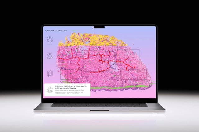
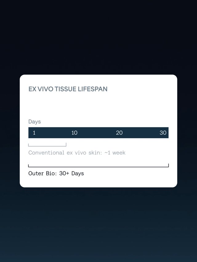

Animating the invisible process
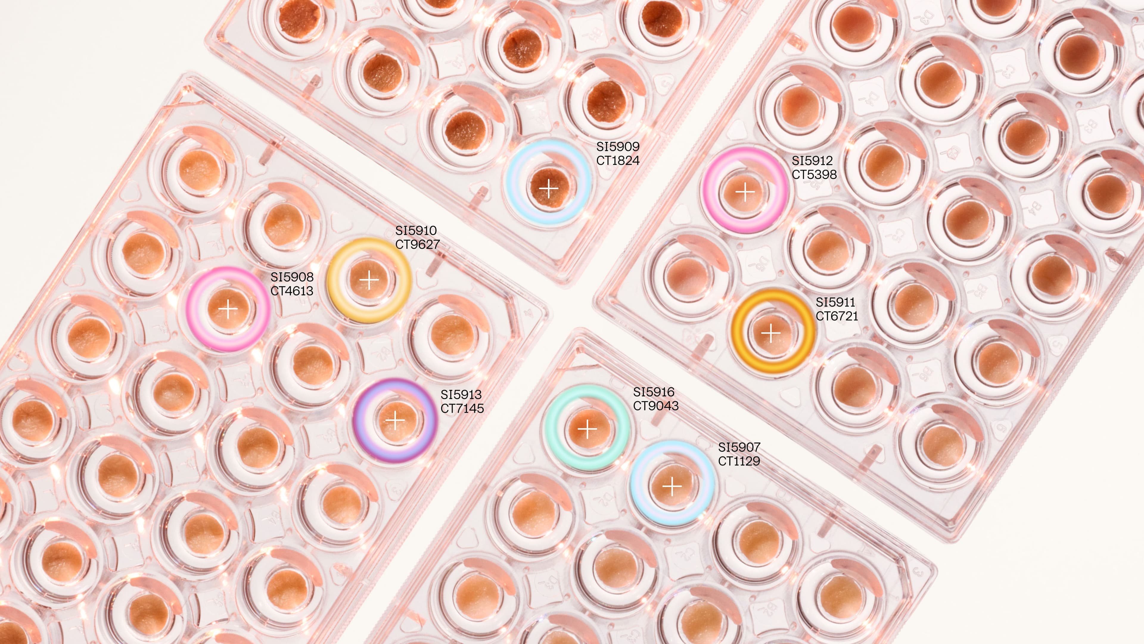
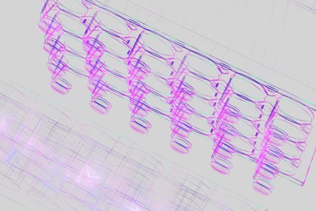
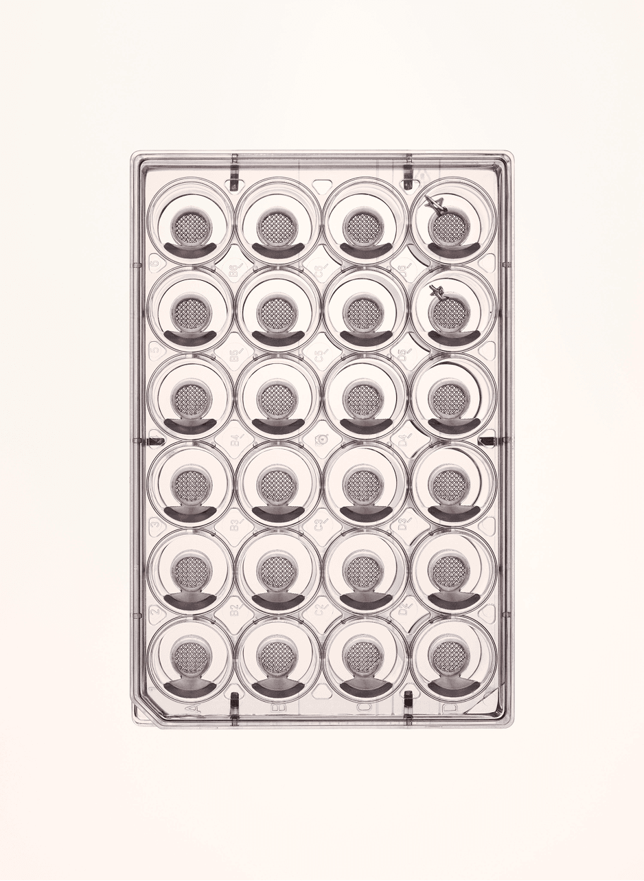
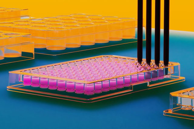
Outer Bio’s motion graphics were built to make complex science legible and inviting, translating technical lab systems and biological processes into visuals anyone could follow without a scientific background. Some moments stayed anchored in real objects, like the custom-designed medical trays. Others opened up into interpretation, like the plate reader sequence using shifting wavelengths of light, or the robotic pipette system, where the mechanics tracked the real process closely but the surrounding environment turned warmer and more tranquil.
Throughout, the priority was staying true to the science while giving the brand a broader tone in motion: bright, soft, saturated with color rather than sterile or mechanical. A language that carries its own pulse without losing the precision underneath.
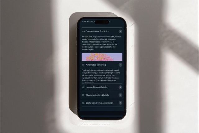

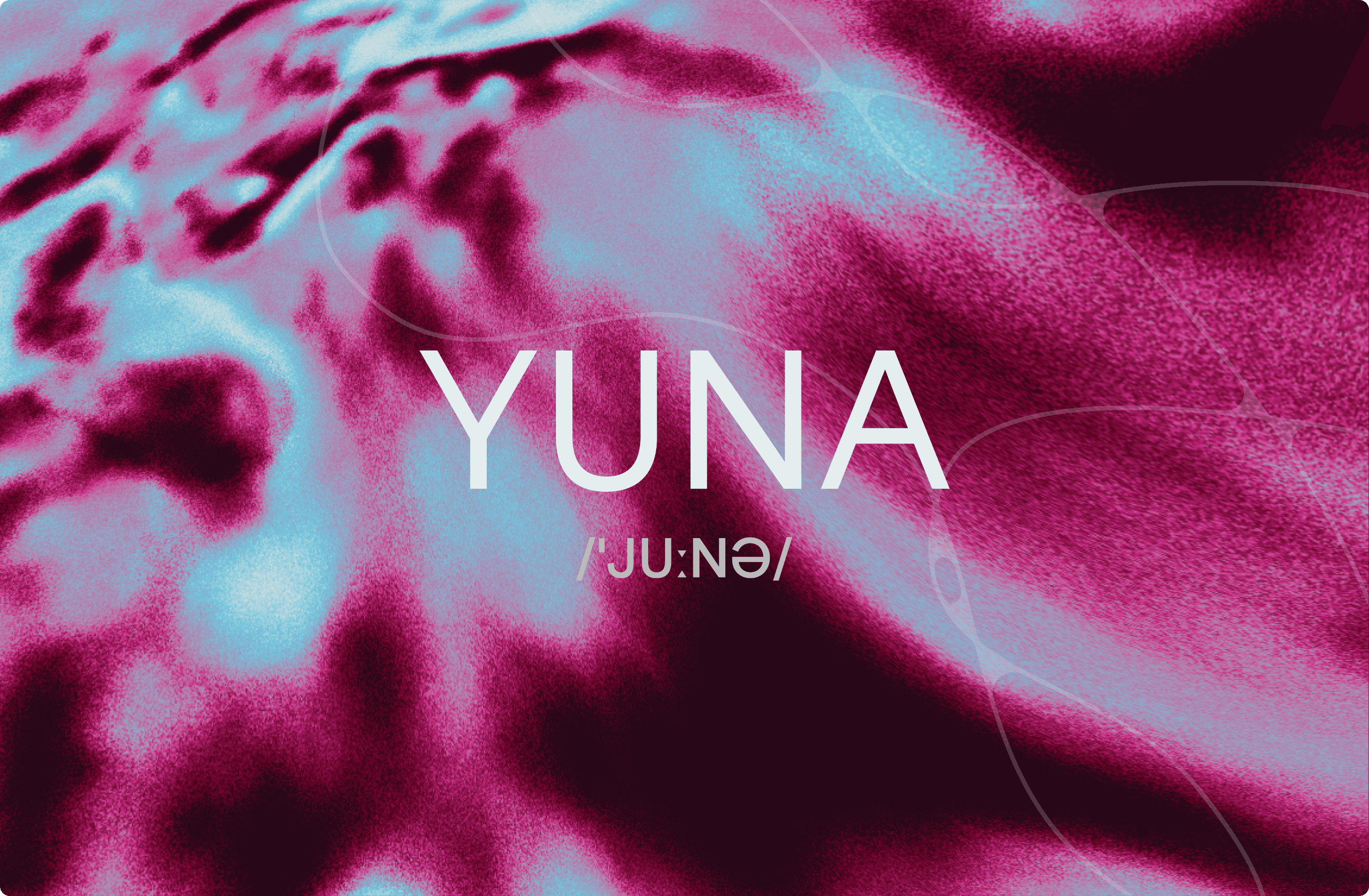
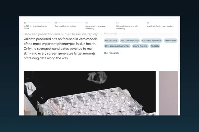
A website structure behaves like science
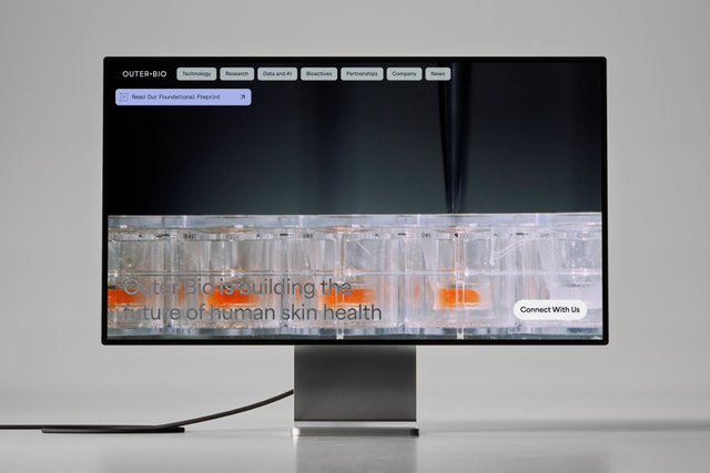
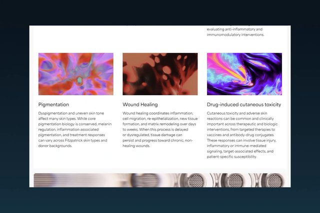
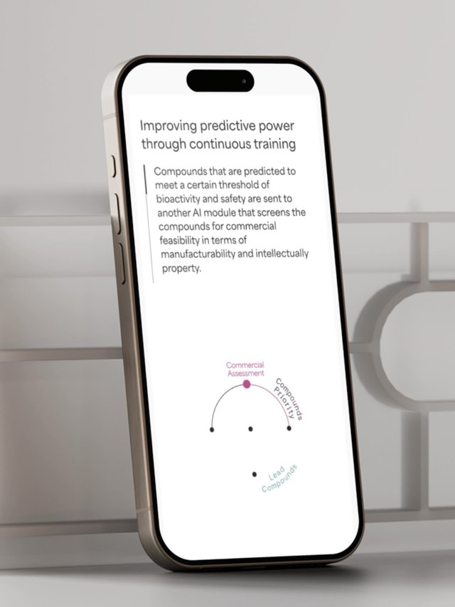
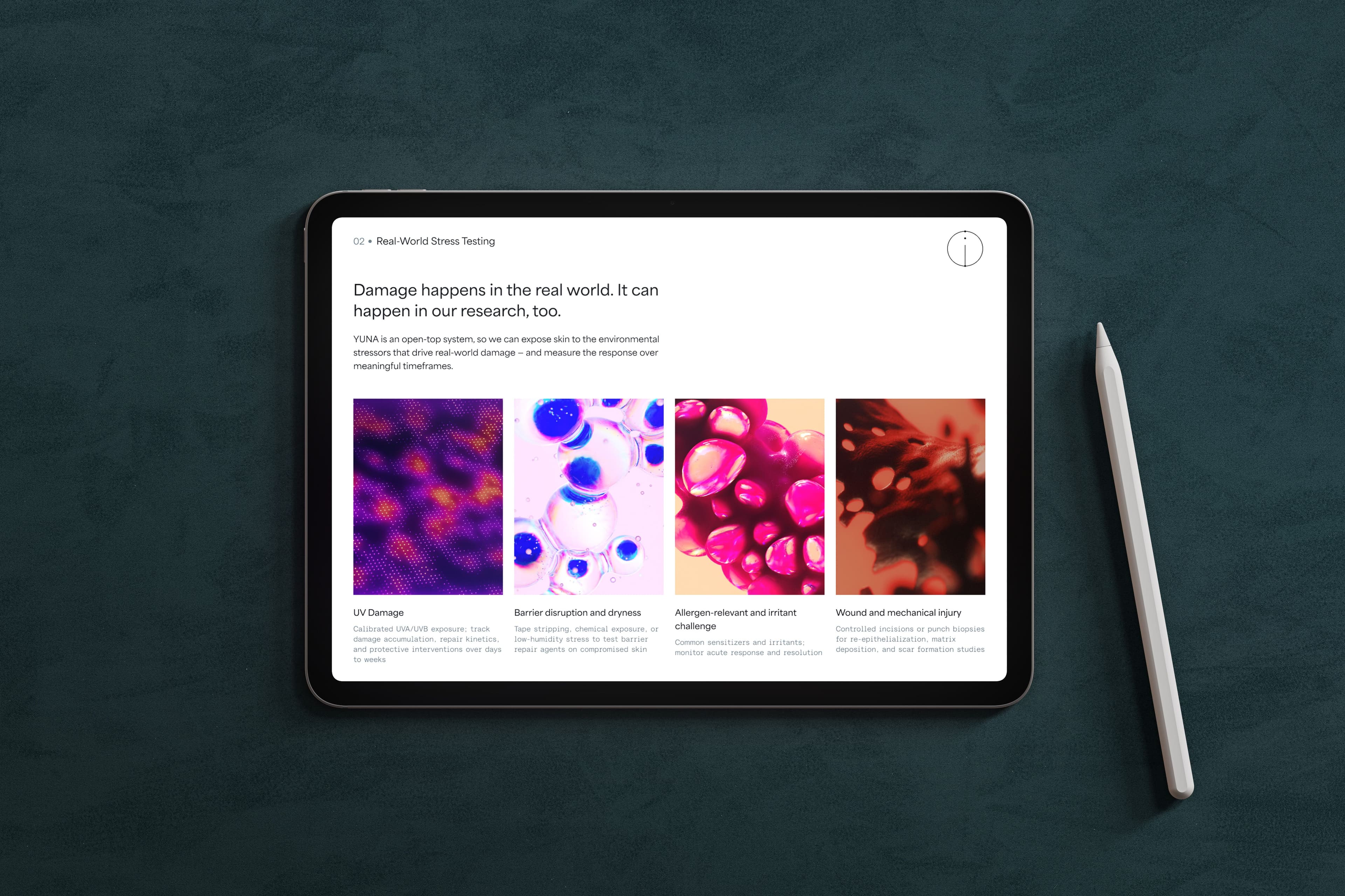
The website carries the brand concept Signal Within into its own architecture. The digital layout becomes another place where the brand's core idea plays out. The top navigation and modular page sections are shaped to echo a connective skin cell. Site structure and content are connected the same way, subtly. The pages move between clear, functional moments and more atmospheric ones, giving Outer Bio's research, imagery, and story room to unfold at their own pace rather than sitting inside a generic template.
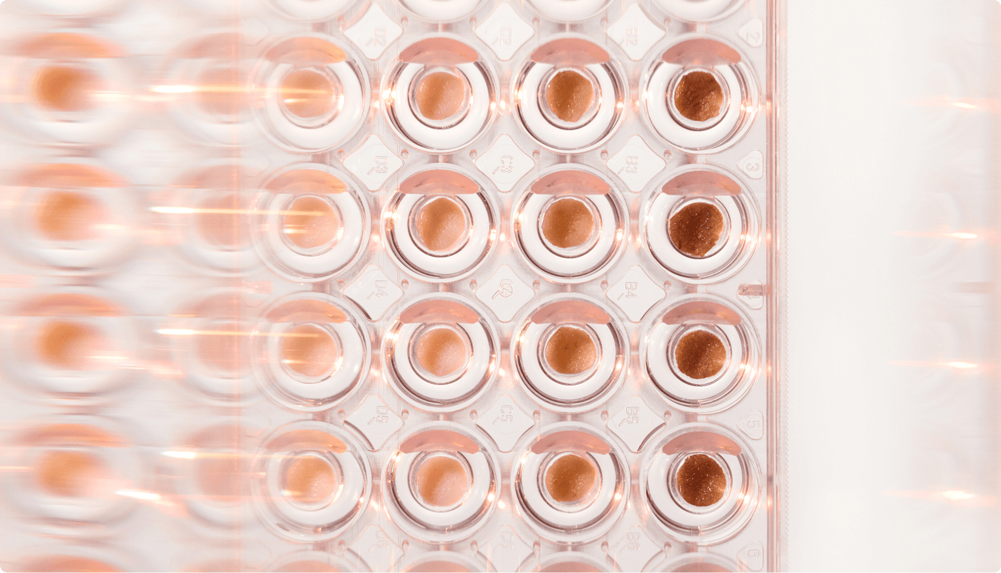
Revealing life beneath the surface
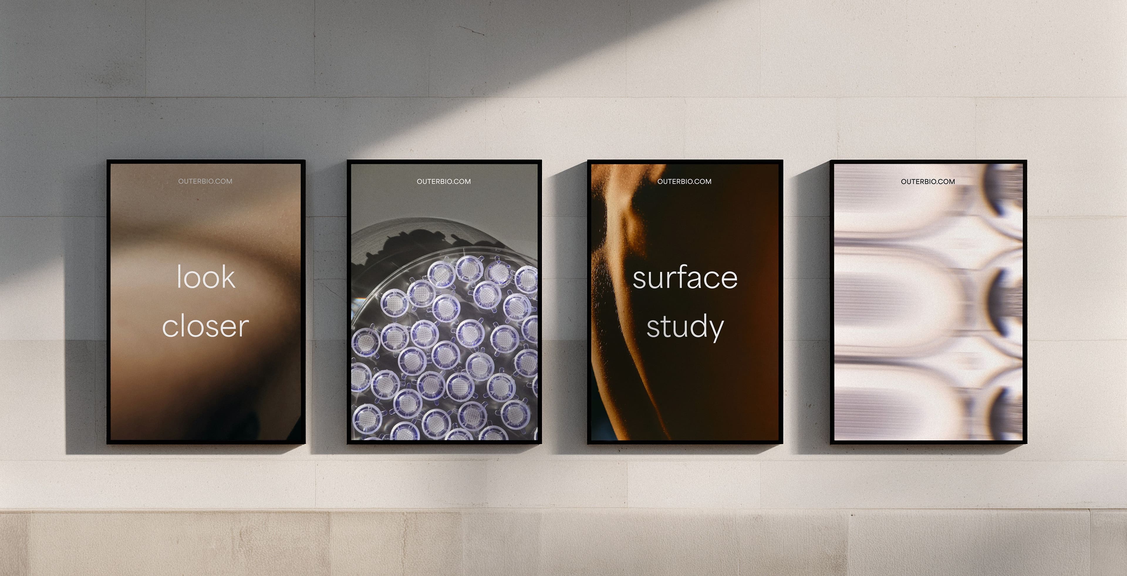
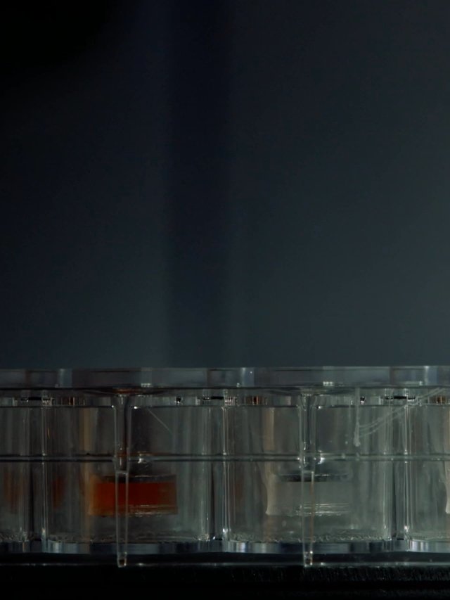
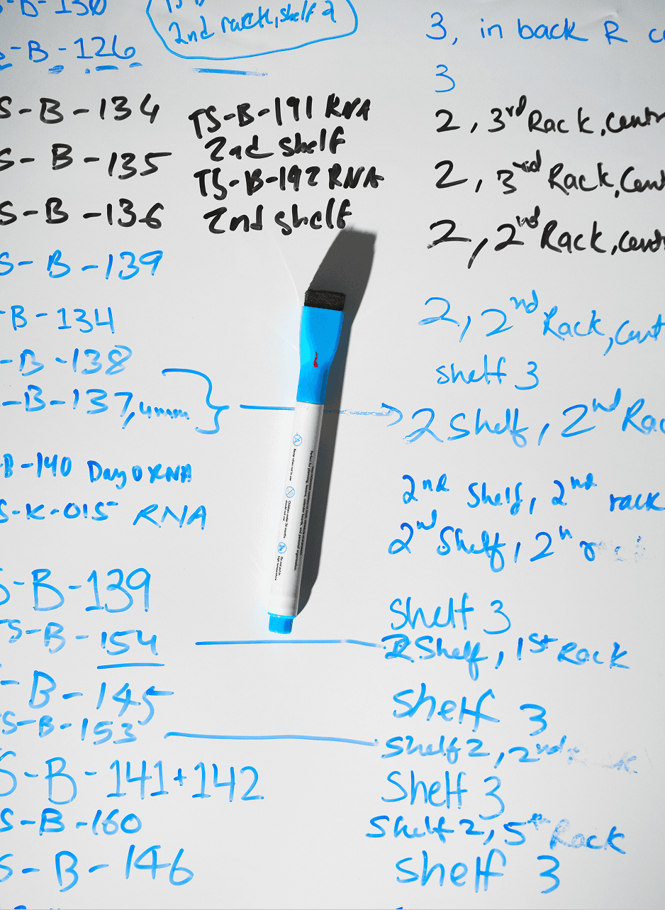
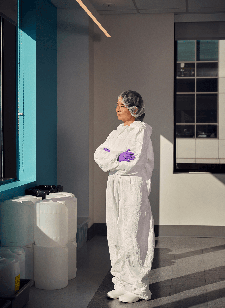
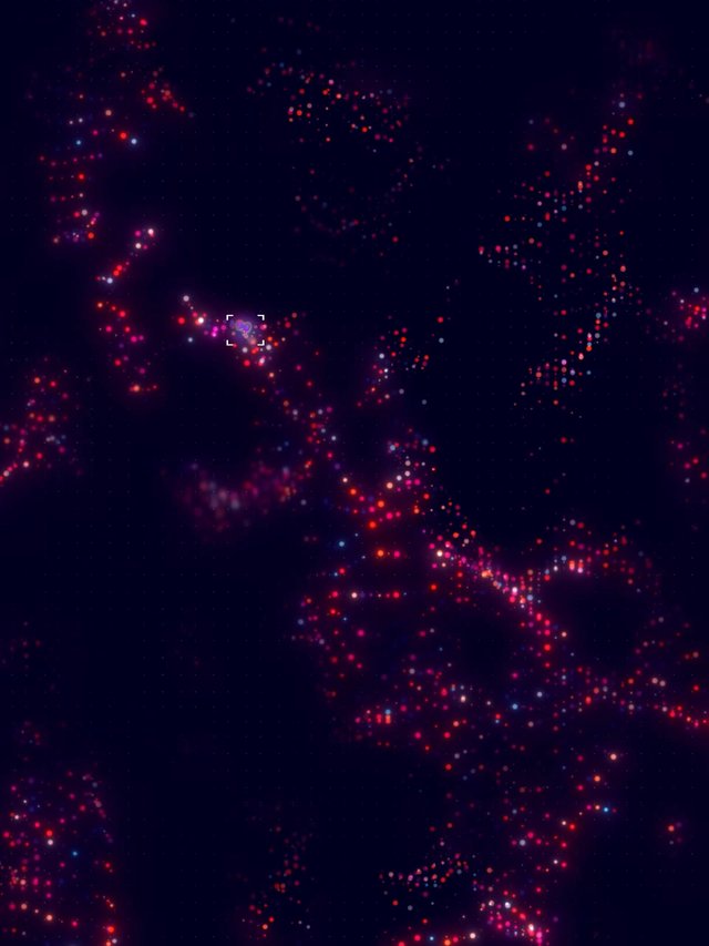
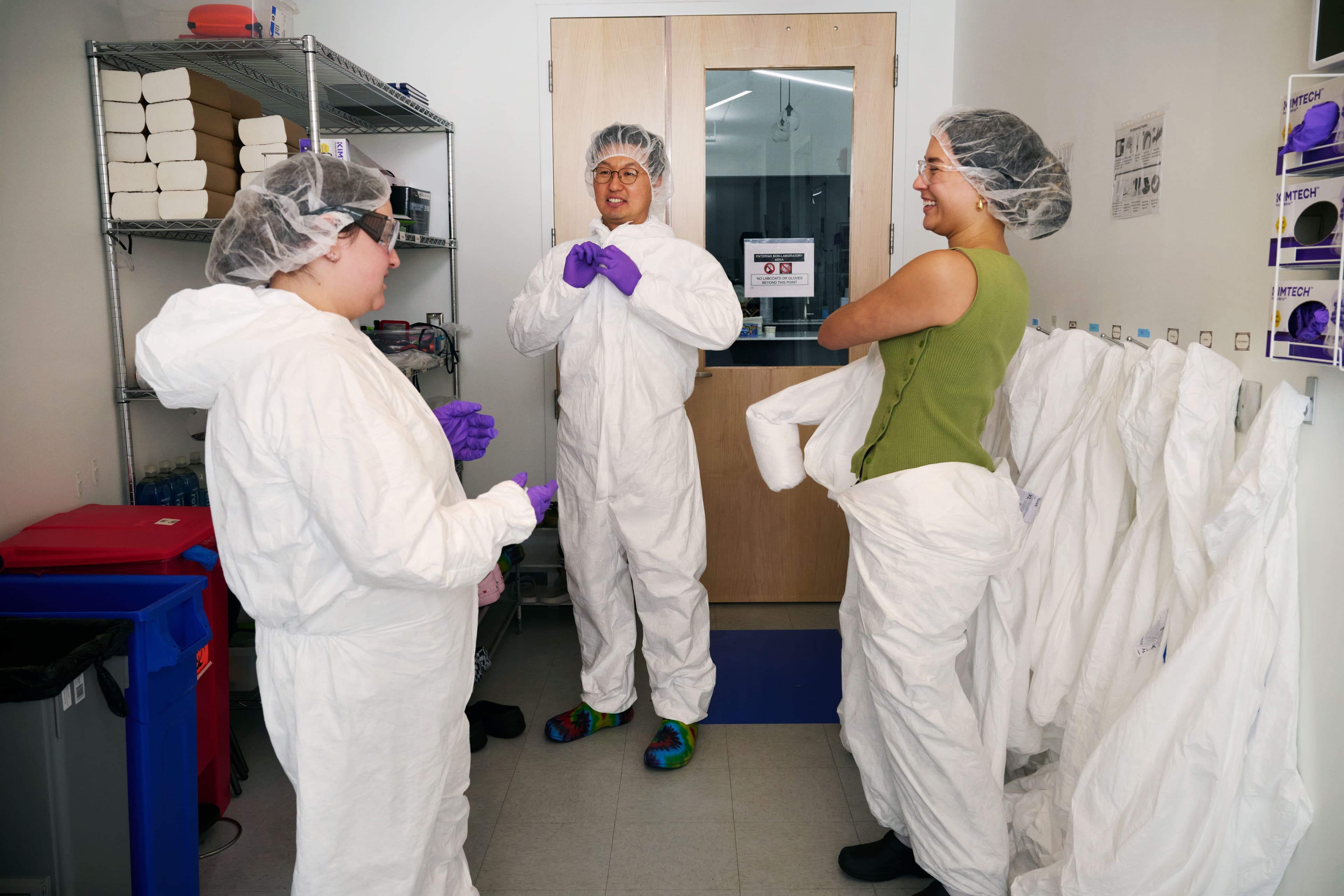
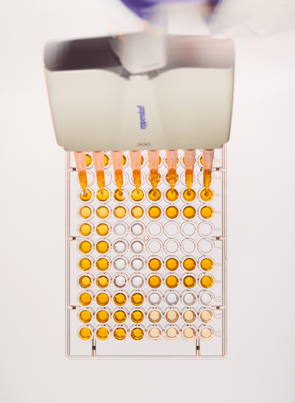
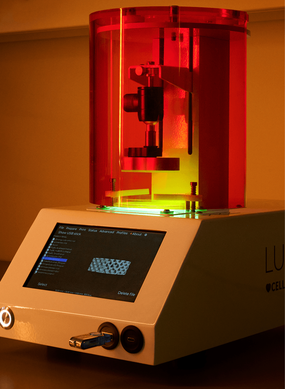
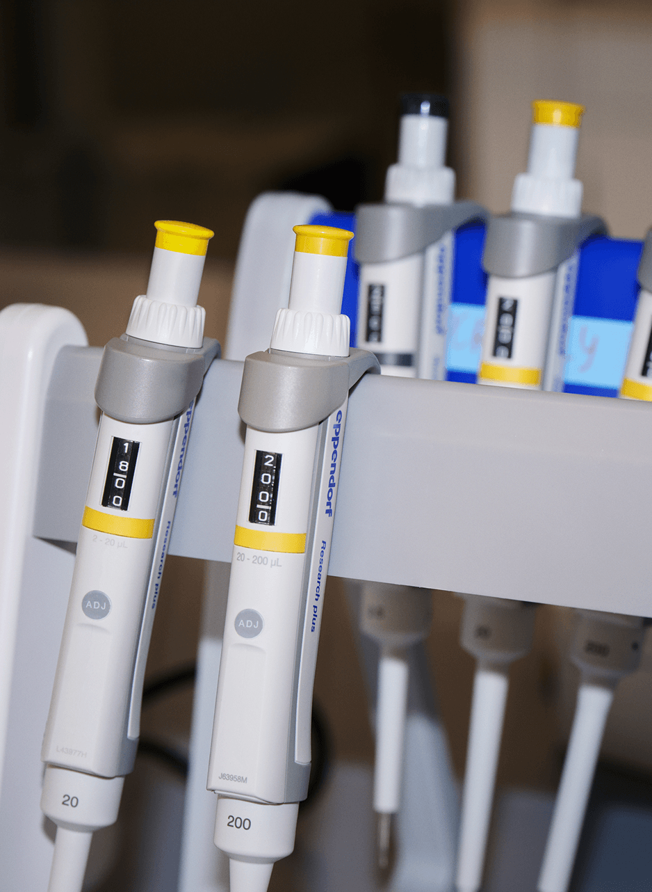
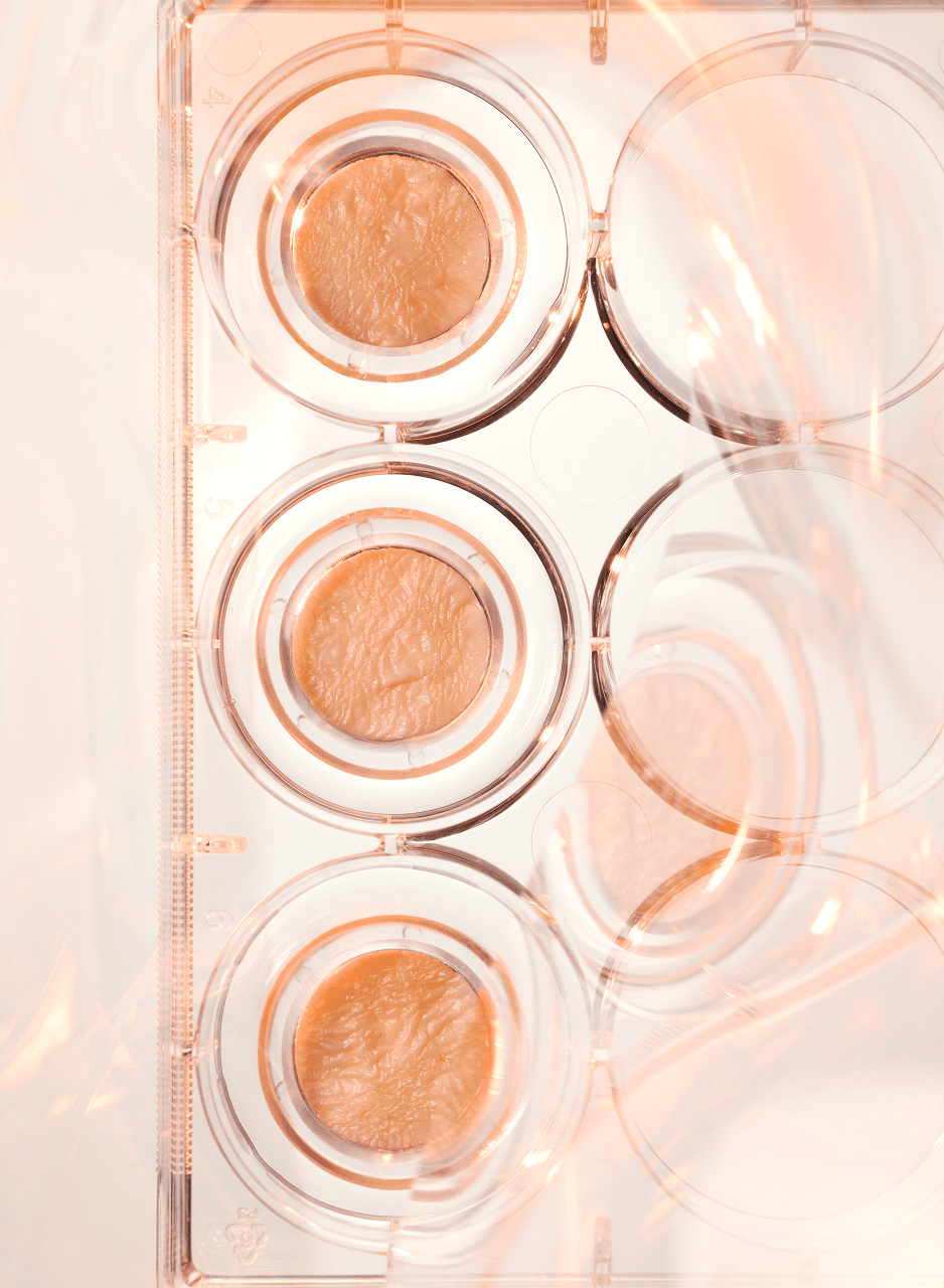
The video and photography approach leans into atmospheric storytelling, textured, dimensional, and tactile, capturing skin and biology as living, expressive systems. Light, shadow, and depth reveal what can’t be directly seen: signals, rhythms, and transformation. Lab imagery complements this with a focus on micro-gestures and the human side of scientific work, evoking quiet mastery where repetition, precision, and dedication become their own form of beauty.
Balancing scientific precision with biological warmth
The typographic system balances clarity and character. Area Normal provides geometric precision and continuity through its circular forms, while Saans SemiMono adds a technical layer for data and annotations.
The color palette pairs scientific rigor with biological warmth, cool teals for depth and credibility, rich plums for skin and life, supported by a range of tones to express variation and complexity. Together, they create a language that feels both engineered and intentional.

Press
TechCrunch |
TechCrunch
Scope
- Visual Identity
- UX/UI
- Art Direction
- Photography
- Videography
- 2D Motion
- 3D Motion
- Brand Guidelines
Links
Team
Melody Yung, Design Direction
Stephanie Jung, Art Direction & Design
Yula Ye, Art Direction & Design
John Rodriguez, Art Direction & Design
Nick Smith, Identity Design
Dylan Griffin / Art Department, Photography
Jacob Wayler, Cinematography
Heath McBride, Digital Tech
Maria Christianson, Lighting Tech
Caroline Tompkins / Giant Artists, Photography
Justin Sarinana, Camera Assistant
Alex Jones, Digital Tech
Dave Herr Studio, Retouching
Studio Scopic, Color Grading
Commerce-UI, Website Development
Credits
Michael Polansky, Co-founder & CEO
Chris Hinojosa, Co-founder & CTO
KJ Jang, Co-founder & CSO
Stanley King II, Co-founder & CBO
Stefani Germanotta, Board Director